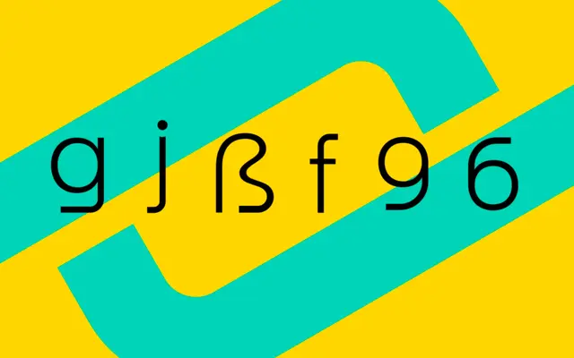
A seven-weight sans-serif drawn from the Art Deco stone lettering of São Paulo's Estádio Pacaembu, available in static and variable formats.
About
Originating as a study of the inscribed lettering found in the Paulo Machado de Carvalho Municipal Stadium, this family translates the geometric Art Deco character of a 1940 Brazilian landmark into a functional type system. Seven weights run from Thin to Black, supported by a variable font, with OpenType features including an alternate single-storey 'a', a short J, an alternative question mark, and case-sensitive forms. Broad Latin language support stretches across hundreds of scripts and creole languages, reflecting the pan-Latin cultural context of its origins.
Classification
Pacaembu is a sans-serif rooted in Art Deco stone lettering, inspired by the geometric and decorative letterforms found at the Estádio Pacaembu, inaugurated in 1940. The family sits between geometric and display sans categories, with clear Art Deco influence in its proportions and detailing.