sans-serifgrotesqueitalic
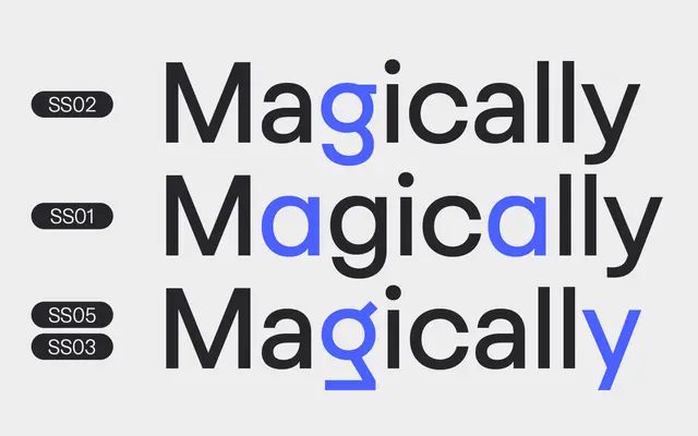
A nine-weight grotesque family blending geometric and neo-grotesque influences, named after its distinctive alternate lowercase g forms.
About
Goga draws on Avenir and Helvetica to produce a neutral, large x-height grotesque suited to both display and text setting. Nine weights from Thin to Black come with matching italics, and the family ships as a variable font with axes for weight and slant. The stylistic alternate lowercase g forms are the one point of character in an otherwise general-purpose offering.
Classification
Described by the foundry as combining geometric sans and neo-grotesque influences, citing Avenir and Helvetica as inspirations; sits squarely in the grotesque category with geometric leanings.
Weights
ThinExtraLightLightRegularMediumSemiBoldBoldExtraBoldBlack
Languages
Latin Extended
Tags
grotesquegeometricneutralbrandingeditorialvariableall-rounder