Alcea
Nice To Type · Gabriel Richter · 2026
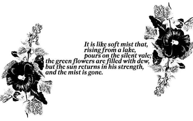
A humanist serif by Gabriel Richter with a distinctly calligraphic logic, where asymmetric serifs, a looped lowercase k and an extensive stylistic set system allow the upright styles to move toward or away from a handwritten register.
About
Designed by Gabriel Richter with spacing and kerning by Igino Marini, Alcea runs from Extra Light to Bold across six weights with matching italics, and is also issued as a variable font spanning weight (200–700) and italic (0°–12°) axes. Its defining characteristic is the treatment of serifs as structurally asymmetric: letters such as v, w, x and y carry a wedge on one side and a serif on the other, following the internal logic of a true italic rather than conventional Roman construction. Twenty stylistic sets allow granular control over how calligraphic or upright each style reads, with small caps, uniwidth punctuation and a thorough set of figure styles rounding out the OpenType palette.
Classification
Alcea is a serif with strong calligraphic roots: its asymmetric serif treatment, looped k, and italic forms that draw from true italic logic place it firmly in the humanist serif tradition, where pen-drawn rhythms inform the upright as much as the italic.