Blow
Nice To Type · Yanik Hauschild · 2019
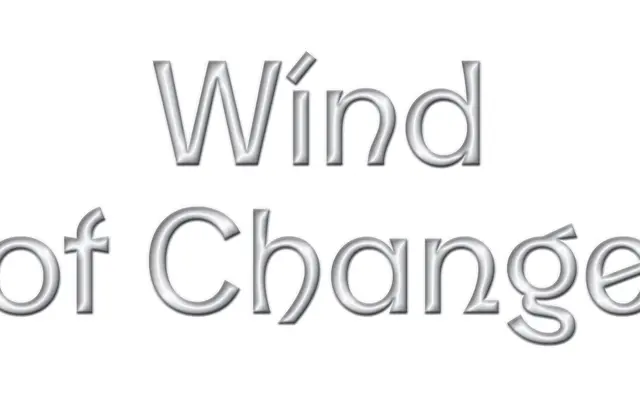
A five-weight geometric sans by Yanik Hauschild that alternates soft curves with sharp straight lines and leans heavily on alternate glyphs for typographic variety.
About
Designed by Yanik Hauschild and published by Nice To Type in 2019, Blow runs from Thin to Bold with linear main strokes that shift between rounded curves and straight edges, giving individual letters a tense, deliberate character. Three stylistic sets and a contextual alternates randomiser provide considerable variation within a single setting, covering uppercase and lowercase forms as well as alternate figures. Diacritics are deliberately thin and wide, contrasting with the more substantial letterforms to keep extended Latin text legible across a broad language range.
Classification
Blow features linear main strokes with soft curves alternating against strong straight lines, giving it a geometric character with expressive personality. Its structured construction and clean architecture place it firmly in the geometric sans tradition.