FF Infra
Nice To Type · Gabriel Richter · 2019
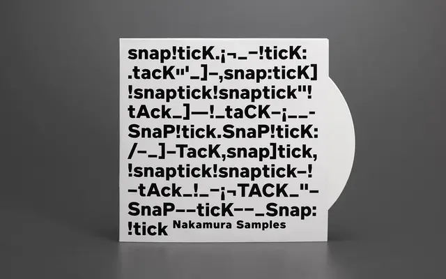
A linear grotesque with open counters and angled stroke endings, designed by Gabriel Richter during his bachelor studies in Düsseldorf and published by FontFont in 2019.
About
Developed originally under the name Richter Grotesk, FF Infra balances a neutral grotesque structure with warmth introduced through open counters and consistently angled terminal strokes on letters such as 'f' and 't'. A generous x-height supports legibility across a wide range of sizes, while an extensive OpenType feature set includes true small caps, oldstyle figures, true capital figures, tabular arrows, alternate forms for 'G', 'a' and the German 'ß', and broad Latin Extended language coverage. Ten weights with matching italics give it considerable range for editorial, identity and screen work.
Classification
FF Infra is explicitly described as a linear grotesque, with open counters, angled ending strokes and a generous x-height that align with the grotesque tradition.