Gain
Nice To Type · Gabriel Richter · 2018
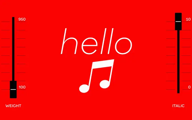
A grotesque sans with early Grotesk character, released by Gabriel Richter in 2018 with ten weights, matching italics and variable font support.
About
Gain draws on the atmosphere of early Grotesk typefaces while softening their cold geometry through subtly bulky forms and a clean, precise stroke. Distinctive letterforms include a single-storey 'G' with a straight stem, a 'Q' with a bisecting tail and a 'K' with a steep leg; slanted spurs on 'a', 'b', 'g' and 'q' aid differentiation at smaller sizes. The family ships with extensive OpenType features including alternate letterforms, tabular figures, circled digits and ornamental punctuation, and is also available as a variable font across weight and italic axes.
Classification
Gain is explicitly described as breathing the atmosphere of early Grotesk typefaces, with slightly bulky forms departing from cold geometry, placing it firmly in the grotesque sans-serif tradition.