Kinetic
NM Type · Noel Pretorius & María Ramos · 2017
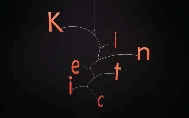
A geometric sans-serif in three weights with italics, designed by Noel Pretorius and María Ramos and inspired by the playful wire sculptures of Alexander Calder.
About
Released in 2017, Kinetic draws on the light, soft visual quality of Calder's kinetic mobiles, translating that sensibility into type forms that avoid rigid mechanical geometry. Optical corrections and character-by-character interpretation keep the design warm and readable across print and screen. The family suits editorial, advertising and corporate or art direction work where a contemporary geometric sans is needed without the coldness of strict construction.
Classification
Explicitly described as a geometric sans-serif; geometry is present in the simple character structure but optical corrections soften any strict mechanical rigidity, placing it within the humanised geometric tradition.