anotherSerif
Not Your Type · Xiaoyuan Gao · 2026
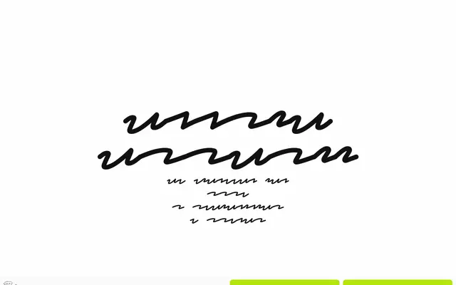
A dot matrix-derived serif by Xiaoyuan Gao that embraces deliberate inconsistency, letting glyph sizes break convention in ways that paradoxically aid small-size readability.
About
Born from dot matrix constraints that no longer need to exist, the typeface treats irregularity as a design principle rather than an error: uppercase P sits smaller than lowercase p, and each glyph operates on its own sizing logic. Three text weights span notLight to notBold, while the Ornament subfamily offers three decorative styles — Arlequin, Box and CRT — extending the family into pattern and texture work. Latin Extended coverage includes Vietnamese, and the glyph set reaches into block elements, geometric shapes and emoji-adjacent symbols.
Classification
Described as mostly serif but deliberately irregular, with glyph sizes that break conventional rules and a dot matrix origin; it sits within display territory due to its intentional inconsistency and decorative ornament subfamily.