commonSans
Not Your Type · Xiaoyuan Gao · 2024
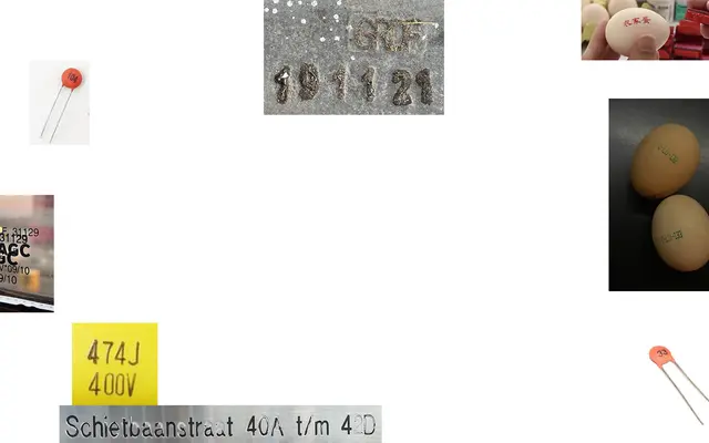
A 14-style family by Xiaoyuan Gao that mines the visual character of ink-spread printing found on eggs, bread clips and capacitors.
About
Designed by Rotterdam-based Xiaoyuan Gao, commonSans draws its formal logic from the bleed and spread of ink on mass-produced everyday objects. The family spans three subfamilies — a single notRegular upright, six condensed weights, and seven condensed badKern variants including stencil cuts — each leaning further into deliberate imperfection. The badKern subfamily introduces intentionally poor spacing as an aesthetic position, making the family as useful for irreverent editorial work as it is for deadpan conceptual projects.
Classification
Although structurally a sans-serif, commonSans is categorised as display due to its deliberately unconventional construction — inspired by ink-spreading artefacts on mass-produced goods — and its inclusion of intentionally malformed variants like badKern and Stencil.