Konrad
Nouvelle Noire · Martina Meier · 2023
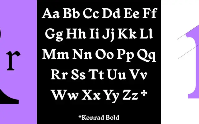
A contemporary interpretation of the earliest printed roman typefaces, drawn by Martina Meier with gothic script traces folded into a clean, modern structure.
About
Martina Meier began researching early roman type specimens at the Zurich University of the Arts in 2015, tracing the letterforms printed by Konrad Sweynheym and Arnold Pannartz at Subiaco in 1465. The result is a three-weight family — Regular, Medium and Bold — that carries archetypical gothic script elements within an otherwise modern and restrained roman. The character set is broad, extending into obscure and uncommon signs that reflect the typeface's scholarly origins.
Classification
Konrad is rooted in the proto-roman typefaces of 1465, the earliest printed roman letterforms, blending incunabula humanist serif characteristics with residual gothic script elements into a contemporary interpretation.