Laca Pro
Nova Type Foundry · Joana Correia · 2020
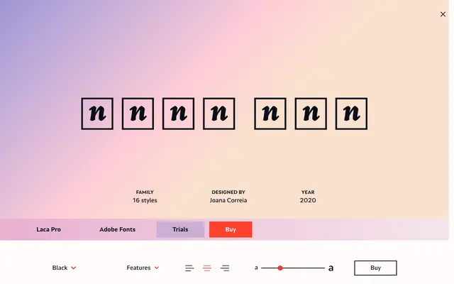
A semi-sans serif by Joana Correia, drawn from retro Portuguese soap packaging and designed to carry warmth and personality across branding and text settings.
About
Inspired by mid-century Portuguese packaging, Laca Pro sits between a conventional sans and something softer, with an upright italic available as a stylistic set for added informality. The family spans eight weights from ExtraLight to Black, each with a matching italic, and covers Latin Extended, Cyrillic and Greek. A broad set of OpenType features includes oldstyle figures, discretionary ligatures, contextual alternates and five stylistic sets.
Classification
Described by the foundry as a semi-sans serif, Laca Pro retains some serif-like qualities while operating primarily within the sans-serif genre, giving it a hybrid warmth suited to branding and editorial use.