Loretta Display
Nova Type Foundry · Joana Correia · 2023
serifdisplay serifitalic
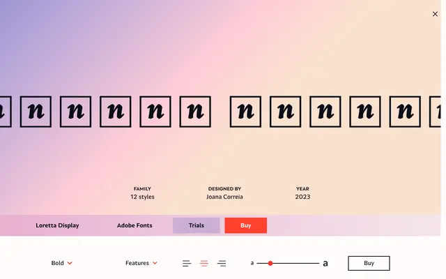
A display-optimised serif designed by Joana Correia, offering six weights with italics for sharp, elegant headline work.
About
Loretta Display is a display-specific variant of Loretta, redrawn for larger sizes where its sharp, elegant character can read clearly. The family spans six weights from Extra Light to Bold, each with a matching italic, giving twelve styles in total. Latin Extended and partial Greek coverage make it serviceable across a range of European languages.
Classification
Described as elegant and sharp, optimised for larger sizes, placing it firmly in the display serif category. Its refinement at headline scale and extended Latin coverage suggest a contemporary editorial serif with high contrast.
Weights
Extra LightLightRegularMediumSemiboldBold
Optical sizes and widths
Display
Languages
LatinLatin ExtendedGreek
Tags
displayeditorialelegantserifhigh-contrastheadlinemagazine