displayreverse contrast
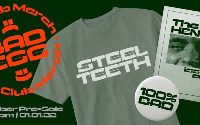
A reverse contrast display face drawing loose inspiration from broad nib calligraphy, reframed for contemporary use.
About
Built around inverted stroke contrast, Jaws takes the weight logic of broad nib calligraphy and turns it on its head. The foundry positions it as a contemporary take rather than a revival, shedding its calligraphic origins in favour of something bolder and more direct. Named after the James Bond henchman, the personality leans into brute force rather than elegance.
Classification
Jaws is explicitly described as a reverse contrast typeface, a display category rooted in broad nib calligraphy that inverts conventional stroke weight logic for expressive, attention-grabbing effect.
Languages
Latin
Tags
reverse-contrastdisplaycalligraphicexpressivedecorativecontemporary