A five-weight geometric display sans drawn in the spirit of Lubalin and Carnase, designed to be set tight at large sizes.
About
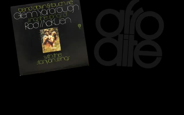
Roko takes its cue from Herb Lubalin's Afrodite logo and the tightly letterspaced geo-sans typography of that era, updated with just enough personality to feel fresh. The family runs five weights from an ultra-light intended only for massive display use through to a more practical bold, with the now-characteristic hugging double-r as its distinguishing detail. Intended for display setting where tight spacing and a hint of retro warmth are welcome.
Classification
Roko is explicitly a display typeface drawn in the spirit of the Lubalin/Carnase geometric sans tradition, with tight letterspacing and personality-driven letterforms intended for large display settings.