Amira Mono
Occupant Fonts · Cyrus Highsmith and Cem Eskinazi · 2025
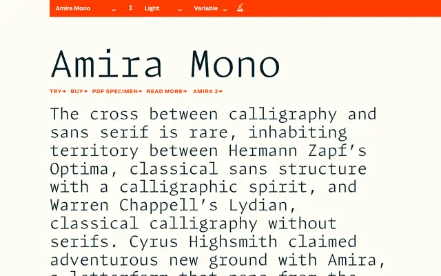
A monospaced adaptation of Cyrus Highsmith's Amira, drawn by Cem Eskinazi in 2025, imposing fixed-width rhythm on calligraphic letterforms that sit between Optima and Lydian in spirit.
About
Where Amira occupies the unusual territory between calligraphic energy and classical sans structure, Amira Mono takes that organic vitality and subjects it to the mechanical regularity of fixed-width spacing. The result is a typeface with genuine typographic texture: the angled, lively strokes of the original survive the monospaced constraint rather than being flattened by it. Ten styles run from Light to Black with matching italics, and coverage extends across Latin, Cyrillic and Greek.
Classification
A monospaced typeface derived from Amira, which sits between calligraphic sans and classical grotesque traditions in the vein of Optima and Lydian; the monospaced constraint imposes fixed-width rhythm on organically calligraphic letterforms.