Carp
Occupant Fonts · Marie Otsuka · 2025
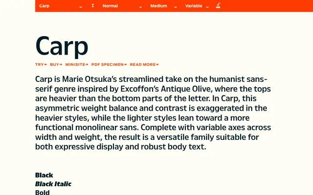
A humanist sans by Marie Otsuka that takes Excoffon's Antique Olive as its starting point, exaggerating the top-heavy weight distribution across a wide variable family spanning three widths.
About
Carp reworks the inverted stroke contrast of Antique Olive, where letterforms carry more weight at the top than the bottom. In heavier styles this asymmetry is pushed further for expressive display use, while lighter weights settle into a more even monolinear rhythm suited to body text. The family spans 36 static styles across Condensed, Regular and Wide widths with six weights each, all with italics, and is available as a variable font with axes for both weight and width.
Classification
Carp is a humanist sans-serif drawing on Excoffon's Antique Olive, characterised by an inverted weight distribution where tops are heavier than bottoms, becoming more pronounced in heavier weights while lighter weights tend toward monolinear.