Ibis Display
Occupant Fonts · Cyrus Highsmith · 2009
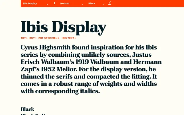
A display serif by Cyrus Highsmith drawing on Walbaum and Melior, offered across three widths and six weights with matching italics.
About
Designed by Cyrus Highsmith in 2009, Ibis Display synthesises Walbaum's classical structure with the squarish geometry of Zapf's Melior, then refines them for display use through thinned serifs and tighter letter-spacing. The family spans Extra Light to Black across upright and standard, Condensed and Compressed widths, totalling 36 styles. A companion text version, Ibis Text, extends its usefulness across continuous reading settings.
Classification
Ibis Display draws on Walbaum and Melior as source material, blending classical transitional proportions with Melior's squarish, low-contrast structure; the display version features thinned serifs and tighter fitting suited to larger sizes.