Prensa
Occupant Fonts · Cyrus Highsmith · 1999
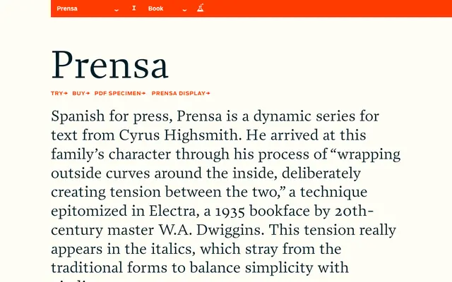
A text serif by Cyrus Highsmith built around deliberate tension between outer and inner curves, taking cues from Dwiggins's Electra of 1935.
About
Designed by Cyrus Highsmith and first released in 1999, Prensa takes its name from the Spanish word for press and is constructed around a technique of wrapping outside curves around the inside, creating visible tension that gives the family its characteristic energy. This tension is most apparent in the italics, which depart from convention to strike a balance between simplicity and vitality. The family runs across six weights from Light to Black, each with a matching italic, and extends into a Display companion with small caps, oldstyle figures and an extensive Latin character set throughout.
Classification
Prensa draws on the tradition of bookfaces with its deliberate tension between outside and inside curves, a technique rooted in Dwiggins-era transitional serifs such as Electra. The dynamic italics and text-optimised proportions confirm its transitional serif character.