Quiosco Display
Occupant Fonts · Cyrus Highsmith, Cem Eskinazi · 2019
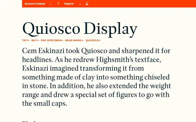
A display-optimised redrawing of Cyrus Highsmith's Quiosco, reinterpreted by Cem Eskinazi with sharpened, stone-cut contrast for headline use.
About
Where Quiosco was drawn with a softness suited to text sizes, Eskinazi's Display adaptation introduces crisper, more chiselled forms that perform at large scale. The weight range is extended beyond the text version, running from Regular to Black with matching italics throughout, and a dedicated set of figures accompanies the small caps. Latin Extended coverage and a full suite of ligatures, oldstyle figures and stylistic alternates make it a complete tool for editorial and typographic display work.
Classification
Quiosco Display is a high-contrast serif adapted for headline use, with sharpened, stone-cut forms that emphasise contrast over the softer clay-like qualities of the text original, placing it firmly in the transitional to high-contrast serif tradition.