Salvo Serif
Occupant Fonts · Cyrus Highsmith · 2011
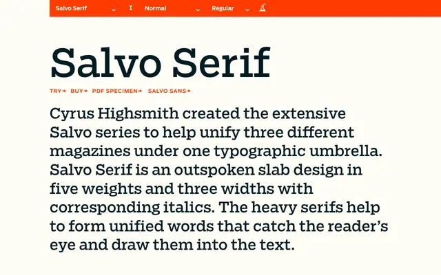
A slab serif by Cyrus Highsmith designed to unify three different magazines under a single typographic system, offered in five weights and three widths with italics throughout.
About
Conceived as a system-level solution for editorial publishing, Salvo Serif spans five weights from Light to Black across regular, condensed and extra condensed widths, each with corresponding italics — 30 styles in total. The heavy serifs are deliberately assertive, building cohesive word shapes that pull the reader's eye. Designed in 2011 alongside the companion Salvo Sans, the family was built to hold together across varied editorial contexts without losing its distinctive character.
Classification
Salvo Serif is explicitly described as a slab design, with heavy serifs that form unified word shapes. The pronounced serifs and sturdy construction place it squarely in the slab serif category.