Weird Serif
Off Type · Alex Slobzheninov
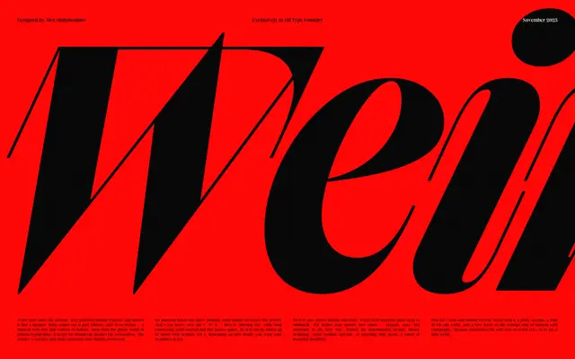
A deliberately distorted take on the Didone genre by Alex Slobzheninov, replacing fashion-world solemnity with unusual hanging serifs and long connecting strokes.
About
Built on the high-contrast skeleton of Didone typefaces common in fashion publishing, it subverts the genre with idiosyncratic downward-hanging serifs on letters like V, W and K, and long connecting serifs that can be toggled via Style Set 1. Twelve cuts span six weights from Thin to Black with matching italics, and a variable font is included. The large x-height and punchy contrast suit display headlines where something more irreverent than a straight Bodoni revival is wanted.
Classification
A Didone-derived display serif with dramatic stroke contrast and a large x-height, but deliberately distorted with unusual hanging and connecting serifs that push it firmly into expressive display territory rather than conventional high-contrast text use.