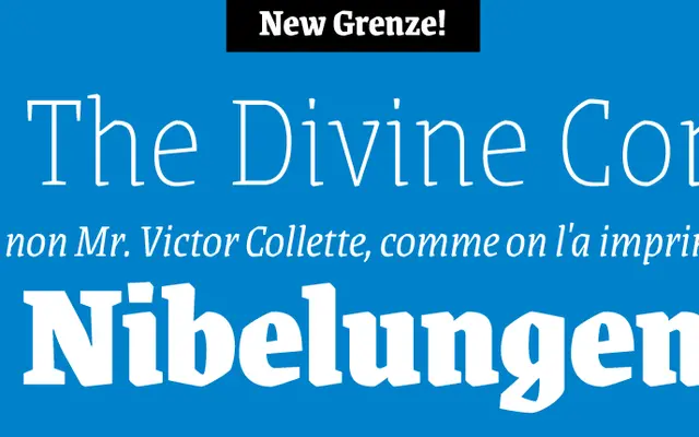
A nine-weight display family that merges Roman and Blackletter structures, designed primarily for magazine typography.
About
Grenze bridges Roman readability and Blackletter texture across nine weights from Thin to Black, each with a matching italic. The family was designed with magazine applications in mind, where its rich tonal palette and expressive letterforms can be used across headlines, pull quotes and display settings. Its name, derived from the word for 'frontier', signals its position at the boundary between two typographic traditions.
Classification
Grenze explicitly blends Roman and Blackletter styles, making it a hybrid display typeface. Its magazine-focused application and textural richness place it closer to display than pure blackletter, though its blackletter heritage is central to its character.