Sansita
Omnibus-Type · Pablo Cosgaya
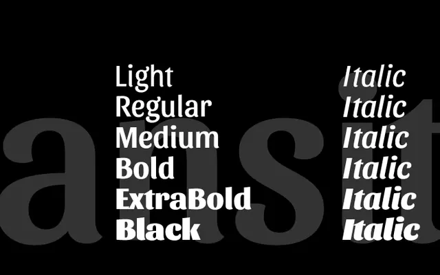
A calligraphic display sans in six weights with matching italics, built around expressive uppercase letterforms suited to branding and editorial headlines.
About
Designed by Pablo Cosgaya with assistance from Ana Sanfelippo and the Omnibus-Type team, Sansita draws on calligraphy and lettering traditions to produce a sans with visible stroke contrast and vigorous uppercase characters. Six weights run from Regular to Heavy, each with matching italics, giving the family enough range for varied headline and packaging applications. The expressive stroke rhythm makes it better suited to short, impactful copy than to extended text.
Classification
A calligraphic display sans with vigorous stroke contrast and expressive uppercase forms, bridging typography, calligraphy and lettering rather than sitting cleanly in any single classification.