Forzata
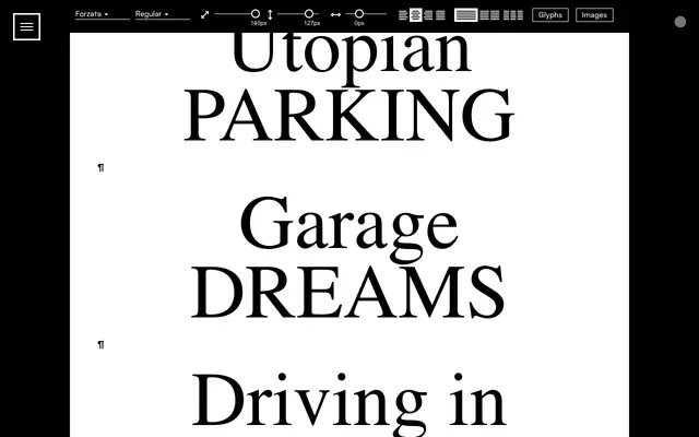
A high-contrast display serif from Or Type drawing on Italian typographic tradition, shown through a specimen steeped in automotive and Renaissance cultural reference.
About
The specimen pairs tightly set Italian motifs, Alfa Romeo, Ferrari, Lancia, Firenze, with passages of Renaissance history, suggesting a typeface built for editorial and cultural contexts that want classical Italian gravitas. Its contrast and bracketed serifs place it squarely in the display register, suited to headlines, posters and short bursts of text at large sizes. The aesthetic sits somewhere between the drama of Italian Baroque letterforms and the graphic vernacular of mid-century motoring print.
Classification
The specimen's strong vertical stress, bracketed serifs, and high contrast suggest a classical Italian display serif tradition, used throughout at large sizes for headlines and short-form editorial text.