Pastiche Grotesque
Order · Benjamin Tuttle
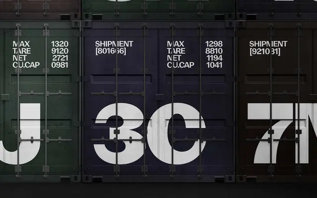
A conceptual sans that asks what neo-grotesque type might look like if it had descended from higher-contrast 19th-century slab-derived gothics rather than from low-contrast forebears like Akzidenz-Grotesk.
About
Designed by Benjamin Tuttle and rooted in research into Gothic No. 578, a peculiar 1898 American gothic that sits between Franklin Gothic and Akzidenz, Pastiche Grotesque takes the clean construction of mid-20th century neo-grotesques and reintroduces the higher stroke contrast characteristic of early gothics lopped from Clarendons and Egyptiennes. The result is a five-weight family with branching structure and weight distribution that read as neo-grotesque at a glance but carry a distinctly older tension in details like the top of the 't' and the weight axis through the 'n'. It is a typeface built from a specific historical hypothesis rather than a straightforward revival.
Classification
A neo-grotesque in structure but with deliberately higher stroke contrast derived from late 19th-century slab-derived gothics, placing it between the historical American gothic tradition and mid-20th century European neo-grotesques like Helvetica and AG Book.