Spades
Order · Sascha Hopson
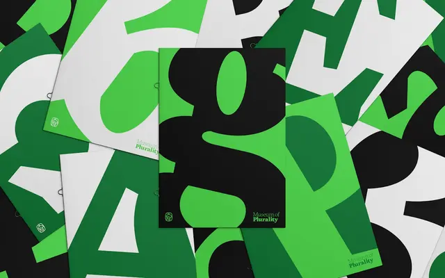
A Baroque oldstyle typeface by Sascha Hopson that draws on Fleischmann's scalloped serifs and the visual tensions of the Black Arts Movement to forge something ornate and subversive.
About
Designed by Sascha Hopson and mastered by Tiny Type Co., Spades combines 18th-century Baroque construction with the deliberate friction of inktraps, producing a serif that is simultaneously archival and charged with contemporary attitude. The conceptual frame pulls from David Hammons and the Black Arts Movement, treating expressive freedom and formal exuberance as shared ground with the Rococo era rather than opposing forces. Five weights from Thin to Black offer a broad range for display and editorial use, each carrying the distinctive scalloped-serif construction and inktrap interruptions that define the family.
Classification
Spades is grounded in 18th-century oldstyle construction, drawing specifically on Fleischmann's scalloped-serif letterforms, with inktraps introduced as a modern structural device. The foundry describes it as a contemporary Baroque typeface, placing it squarely in the historical serif tradition with a distinctly expressive character.