Vanity
Order · Emily Klaebe · 2024
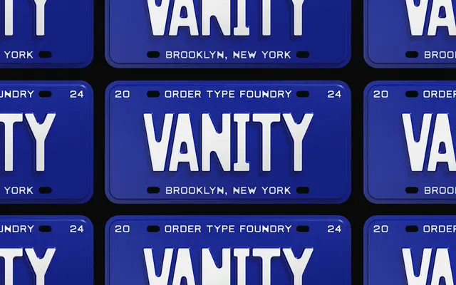
A two-width unicase typeface drawn from the embossed and painted letterforms of New Jersey licence plates spanning the 1930s to the 1990s.
About
Concept by Jesse Reed and designed by Emily Klaebe at Order, the family treats licence plate typography as source material rather than mere reference, preserving the octic geometry, rounded corners and paint-bleed idiosyncrasies that make those letterforms recognisable. The two widths — Condensed and Expanded — mirror the typographic hierarchy found on the plates themselves, where a tighter style carried the registration number and a wider style supported secondary information. Diagonal letters such as M and W retain the deliberate weight variation seen on 1920s and 1930s New Jersey plates, keeping the rhythm of the original material intact.
Classification
An octic unicase display typeface derived from the engineer-constructed letterforms of New Jersey licence plates; its geometric rigidity, rounded corners and deliberate material imperfections place it firmly in the display category rather than any conventional sans-serif lineage.