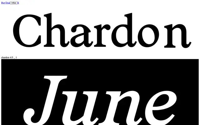
A text serif from OTT Foundry offered in Regular and Italic, designed around the demands of sustained reading in editorial and journalistic contexts.
About
Chardon is a high-contrast serif cut in Regular and Italic, with specimen copy drawn entirely from long-form editorial writing — art criticism, science journalism, political commentary. The proportions and rhythm suggest a typeface built for magazine and book typography rather than display use. The pairing of roman and italic is the family's full extent, keeping the offering focused and purposeful.
Classification
The specimen pages show a serif typeface with strong contrast between thick and thin strokes, classical proportions and an accompanying italic, consistent with a transitional or neoclassical serif tradition suited to long-form editorial text.