Dank
OTT Foundry · Axel Pelletanche
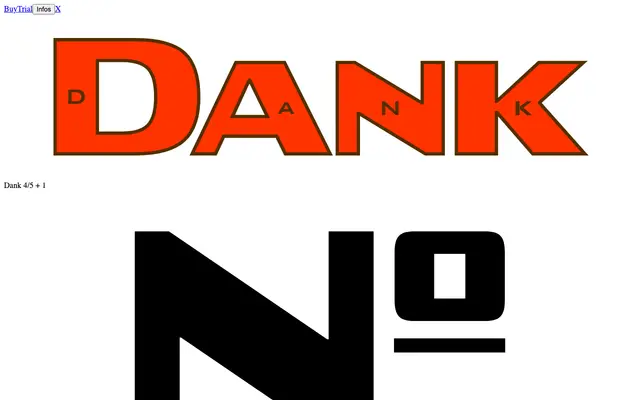
A wide, angular sans-serif drawn from the Bank Gothic tradition, designed to reframe that style's rigid industrial associations towards new contexts.
About
Drawing directly from Morris Fuller Benton's Bank Gothic (1930), Dank inherits its broad silhouette and geometric angularity while introducing deliberate irregularities that give the face its own rhythm. An alternate character set allows optional small slab serifs, adding a second register for use. The result is a display sans with familiar visual weight — stadiums, logistics, game covers — but with enough considered craft to escape those clichés.
Classification
A wide, angular sans-serif drawn in direct homage to Bank Gothic, with optional slab-serif alternates; its broad silhouette and geometric rigidity place it firmly in the grotesque tradition with display-oriented characteristics.