Harker
OTT Foundry · Thomas Bizzarri and Alain Rodriguez
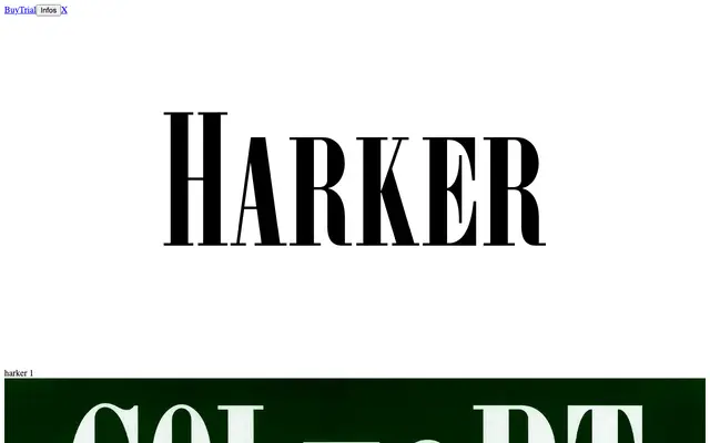
A condensed, high-contrast didone display type drawn from 19th-century all-capitals foundry specimens, routed through the 1937 Deberny & Peignot typeface Olympic, with two capital heights for varied composition.
About
Designed by Thomas Bizzarri and Alain Rodriguez, Harker traces a lineage from anonymous 19th-century display types through Olympic, the Deberny & Peignot revival of 1937, reinterpreting their formal qualities for contemporary use. The typeface pairs the calligraphic origins of letter construction with geometric rationalisation, and its two capital heights recall the compositional methods seen on serialised literature covers and early advertising of the era. Named after the narrator of Bram Stoker's Dracula, it speaks directly to a tradition of bold, typographic title-setting that resurfaces across decades, from Club du Livre to 1990s film and music packaging.
Classification
Harker is a condensed, high-contrast typeface with thin flat serifs in the Didot tradition, drawing on 19th-century all-capitals display types via the 1937 Deberny & Peignot revival Olympic. Its display-oriented construction and dual capital heights place it firmly in the decorative didone category.