Harry
OTT Foundry · Eliott Grunewald
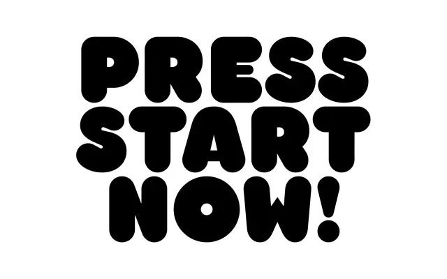
An interpretation of William Bill Seifert's 1970s VGC typeface 'Too Much', a lesser-known contemporary of Frankfurter with more contrast and eccentric letterforms.
About
Designed by Eliott Grunewald, Harry draws from 'Too Much', a capitals-only display typeface created by William Bill Seifert for VGC in the 1970s. Where Frankfurter leans mono-linear, the source material offered higher contrast and some unexpected letter constructions; this revival retains that character while refining weights, curves and proportions. Coverage extends across Latin Extended, supporting a wide range of European languages.
Classification
Harry is an uppercase-only display typeface derived from a 1970s VGC design, featuring high contrast and irregular letterforms characteristic of the bold, playful display styles of that era, closely related to Frankfurter.