Marlfield
OTT Foundry · Eliott Grunewald
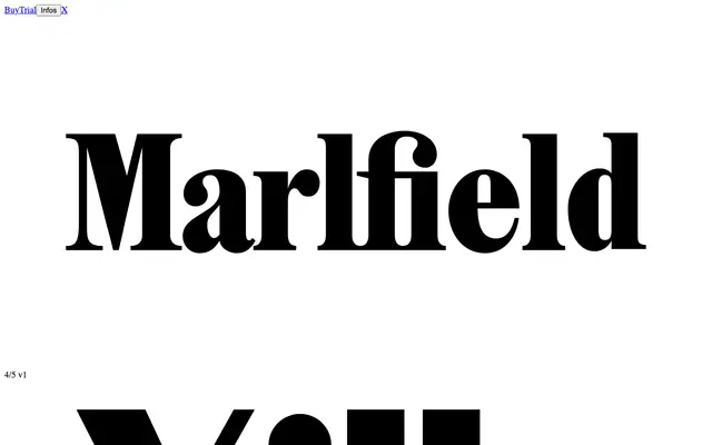
A condensed display serif designed for magazine covers and headlines, with a companion sans family that quietly echoes mid-century French lettering.
About
Marlfield was conceived almost as a single emblematic sign before expanding into a four-style family: Regular and Bold serifs, plus Sans Regular and Sans Bold. Its structure borrows from early 20th-century press typefaces, then reinterprets them through tight spacing, a high x-height, and shortened ascenders and descenders to create a dense, space-claiming presence. The sans counterparts were entirely redrawn rather than simply stripped of serifs, drawing on the spirit of Cassandre and Excoffon without direct imitation.
Classification
Marlfield is a condensed display serif with high contrast and a tall x-height, drawing on early 20th-century press typefaces such as Plantin and Times New Roman. Its condensed construction and editorial origins place it firmly in the display category, with a companion sans family that echoes French lettering of the 1930s to 1950s.