Moore
OTT Foundry · Eliott Grunewald
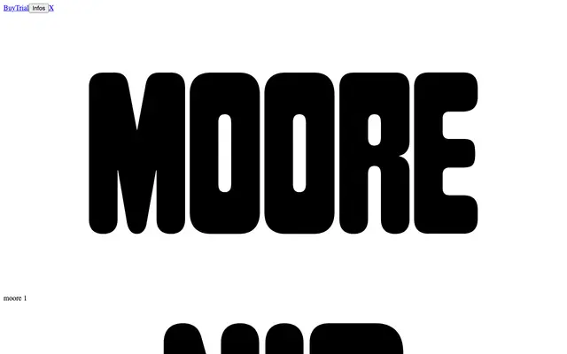
A rounded, condensed display typeface revived from a little-known 1968 Tate Gallery poster for an exhibition of sculptor Henry Moore, with deliberate weight inconsistencies retained as a design feature.
About
Designed by Eliott Grunewald with the help of Olivier Lebrun, Moore reconstructs a full alphabet from the handful of letters found on an anonymous 1968 Tate Gallery poster. The original typeface's variation in stroke weight between letters, which might read as error in another context, is preserved and at times amplified, giving the face a playful, handcrafted quality rare in a display type of this condensed proportion. It has seen use in cultural and arts contexts including festival posters and theatre productions, which suit its bold, tightly spaced character well.
Classification
A condensed, rounded display typeface with modular construction and intentional weight variation between letters, derived from a 1968 Tate Gallery exhibition poster. Its expressive, singular-weight design places it firmly in the display category.