Wien
OTT Foundry · Eliott Grunewald
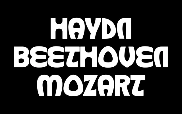
A display typeface rooted in the organic, calligraphic letterforms of the Vienna Secession and Jugendstil movements of the early 20th century.
About
Drawing on the typographic experiments published in magazines such as Ver Sacrum and Die Fläche, Wien revives the fluid, Gothic-inflected character of secessionist type design from Vienna circa 1898 to 1910. The letterforms reflect the movement's characteristic relationship between text and image, with curves and organic strokes that were considered barely legible by contemporary audiences. Designed by Eliott Grunewald with development and mastering by OTT Foundry, it suits editorial and cultural projects where a historically grounded decorative voice is required.
Classification
Wien draws on the calligraphic, organic typographic forms of the Vienna Secession and Jugendstil movements, with strong Gothic influence and fluid strokes that place it firmly in the decorative display category.