PTS Pharma
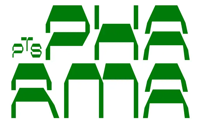
An angular reverse-contrast display family across seven weights and three widths, with thick horizontals giving the letterforms a striking, unconventional rhythm.
About
Reverse-contrast construction inverts the usual stress axis, placing weight on the horizontals rather than the verticals, which produces an immediately distinctive texture at headline sizes. The family runs from Light to Black across standard, SemiExpanded and Expanded widths, giving 21 styles in total. An extensive set of discretionary ligatures, covering uppercase, mixed-case and lowercase pairs, adds further personality suited to logotype and identity work.
Classification
Angular reverse-contrast letterforms with thick horizontals and thin verticals place this firmly in the display category; the unconventional stress inversion makes it unsuitable for text use and signals a purely expressive, display-oriented purpose.