Borges Open
Pampatype · Alejandro Lo Celso · 2004
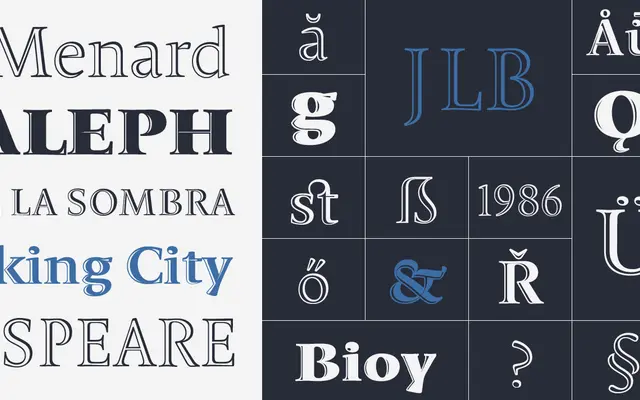
An engraved display serif by Alejandro Lo Celso, comprising four weights from Light to Black, each calibrated to deliver a distinct degree of epigraphic weight and refinement in titling settings.
About
Designed by Alejandro Lo Celso and part of the wider Borges family, Borges Open uses inline strokes to produce an engraved, openface effect suited to headings, logos and display settings. The Light style, the original and the one recognised by Matthew Carter at the Morisawa Awards in Tokyo 2002, carries a classical serenity; each subsequent weight increases shade and presence without sacrificing the family's epigraphic character. The typeface takes its name from Jorge Luis Borges, and Lo Celso's stated model was Borges's writing practice: precise, economical and always in pursuit of the exact word.
Classification
An engraved, openface display serif with garalde proportions and inline strokes. The Pampatype characteristics list it as garalde, inline and openface, placing it firmly in the display category rather than text serif.