Borges Titling
Pampatype · Alejandro Lo Celso · 2004
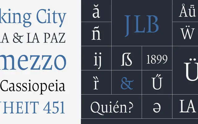
A delicate titling roman by Alejandro Lo Celso, drawn with refined proportions and accentuated contrast to complement the Borges text family.
About
Conceived as the titling counterpart to Borges, this garalde roman features slightly more elongated serifs, heightened stroke contrast and more economical vertical proportions than the text versions. The family takes its name from the Argentine writer Jorge Luis Borges, whose exacting prose suggested clean, elegant letterforms. Borges Open Light was recognised by Matthew Carter at the Morisawa Awards in Tokyo in 2002, and the family sits well in literary, editorial and magazine contexts.
Classification
Pampatype explicitly tags it as Garalde and Old-Style; the typeface exhibits classic old-style serif traits with moderate stroke contrast, bracketed serifs, and calligraphic stress, conceived for bookish titling use.