Margarita
Pampatype · Alejandro Lo Celso · 2010
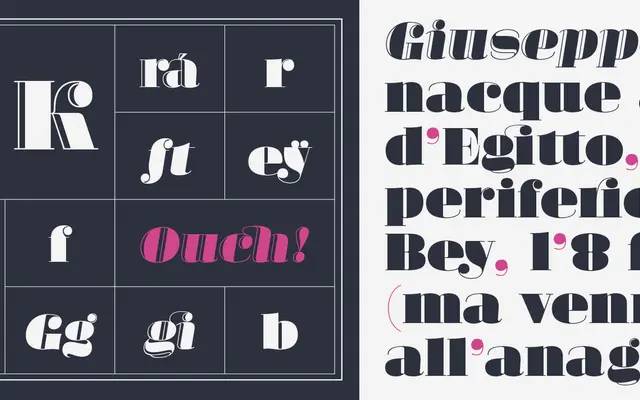
A humorous, high-contrast fat face by Alejandro Lo Celso, designed in the tradition of Bodoni and Didot and named after Bodoni's widow, available in solid and engraved cuts.
About
Released in 2010 and extended in version 2.0, Margarita takes the extreme stroke contrast of the Didone tradition and pushes it into fat face territory for titling and poster use only. The family runs to four fonts: roman and italic in both a solid and an open-face (Luce) form, each carrying an extensive set of OpenType alternates and a full suite of ornaments for building frames and decorative backgrounds. Awards from Tipos Latinos 2010 and the Hii Type contest attest to its standing within the Latin American and international type community.
Classification
A Didone-derived fat face intended exclusively for large display sizes, with extreme stroke contrast in the tradition of Bodoni and Didot, and an engraved (open face) variant alongside the solid roman and italic.