Quimera
Pampatype · Alejandro Lo Celso · 2002
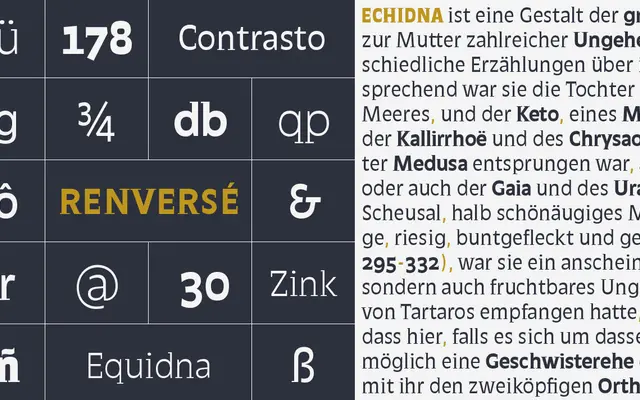
A reverse-contrast display serif by Alejandro Lo Celso that grafts thin, capricious serifs onto a sans-serif modulation, drawing loose inspiration from Roger Excoffon's Antique Olive.
About
Designed in 2002, Quimera pairs open counterforms with a characteristic horizontal-contrast structure that the foundry describes as a 'sanserif avec' — a sans with serifs. The family runs across four weights from Blanca to SúperNegra, plus a Compacta cut for tighter settings, all in Basic Latin coverage. Its informal warmth and screen-friendly apertures make it suited to posters, cards and display text where a quirky typographic personality is wanted.
Classification
Quimera carries thin, horizontal serifs on a sans-serif modulation, producing a reverse contrast structure. The foundry describes it as a hybrid display type, inspired by Excoffon's Antique Olive, making display the most accurate primary category.