Charlevoix Pro
Pangram Pangram Foundry · Mat Desjardins · 2015
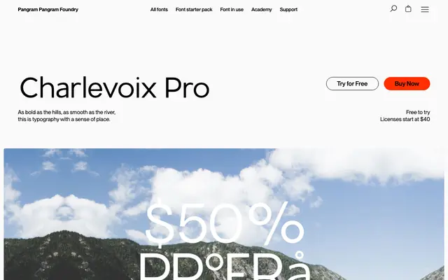
A display sans with slightly rounded corners, drawing loose inspiration from the Charlevoix region of Quebec for use in headlines and brand work.
About
Designed by Mat Desjardins and released in 2015, it comes in nine weights from Thin to Black, each with 325 glyphs covering a broad range of Latin-script languages. The rounded terminals soften an otherwise sturdy grotesque skeleton, making it more approachable at large sizes without losing structural clarity. A practical choice for editorial titles, posters and brand identities where a headline face with some warmth is needed.
Classification
Classified by the foundry as Grotesk and Sans Serif, but the slightly rounded corners, large display intent and regional inspiration push it firmly into display territory. Its structure is geometric with humanist softening rather than a workhorse grotesque.