Frama
Pangram Pangram Foundry · Samuel Salminen, Mat Desjardins, Francesca Bolognini
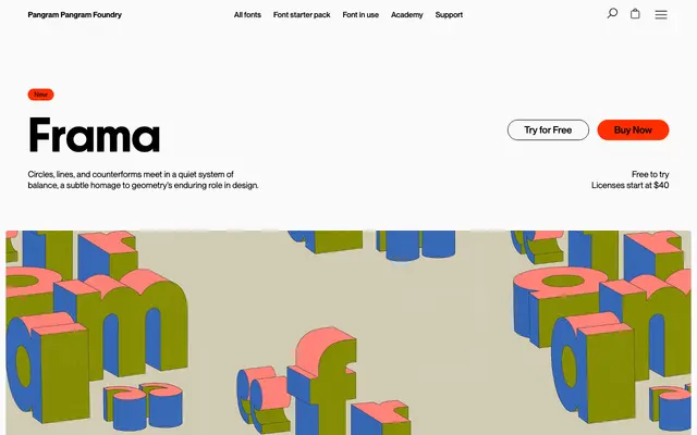
A geometric sans serif in Display and Text cuts, drawing on Futura and Avant Garde while introducing optical warmth through subtle irregularities.
About
Designed by Samuel Salminen, Mat Desjardins and Francesca Bolognini, Frama is built from circles, straight lines and carefully weighted counterforms that recall early 20th-century modernism without copying it. Nine weights run from Thin to Black with matching italics in both the Display and Text subfamilies, and a variable font covers the full range. Stylistic alternates for characters including 'a', 'g', 'M' and punctuation give designers room to shift tone without breaking the family's underlying calm.
Classification
Explicitly rooted in 20th-century modernism with Futura and Avant Garde as reference points; letterforms built from circles, straight lines and considered counterforms in the geometric sans tradition.