Fuji Sans
Pangram Pangram Foundry · Mat Desjardins · 2016
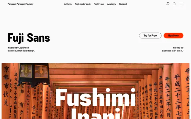
A slightly condensed grotesque sans in four weights, drawing on Japanese design principles of restraint and structural clarity.
About
Designed by Mat Desjardins and named after Mount Fuji, the typeface takes slightly condensed proportions and structured curves as its formal premise. Four weights run from Light to Bold with variable font support, covering Latin Extended character sets across more than 30 languages. Suited to brand identities, editorial headlines and digital interfaces where a clean, controlled grotesque is needed without obvious personality quirks.
Classification
Described by the foundry as a grotesk sans-serif; slightly condensed proportions and structured curves place it firmly in the grotesque tradition with geometric influences.