Grafier
Pangram Pangram Foundry · Alex Slobzheninov · 2018
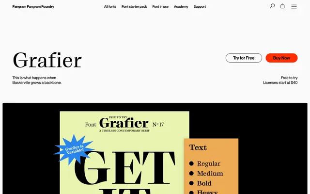
A Baskerville-derived serif by Alex Slobzheninov that replaces curved serifs with hard, flat cuts and flag-terminals for a blunt, architectural effect.
About
Starting from the proportions and weight contrast of 18th-century Baskerville, Grafier strips out the calligraphic softness and replaces it with straight serifs that join letterforms with no curves, alongside chopped terminals and squarish punctuation. The family runs across five weights in both Text and Display contrast variants, with a variable font spanning weight and contrast axes. Cyrillic support broadens its reach, and stylistic alternates that disconnect serifs offer a usable option at smaller sizes.
Classification
Grafier takes Baskerville as its structural starting point but replaces classical curved serifs with uncompromisingly straight, flat serifs and flag-terminals, giving it a brutalist edge that sits between transitional serif tradition and contemporary architectural letterform design.