Right Didone
Pangram Pangram Foundry · Alex Slobzheninov · 2022
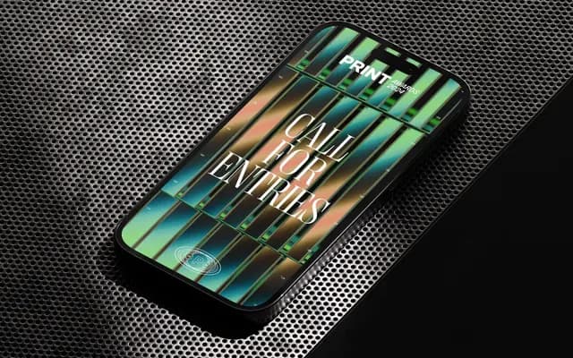
A high-contrast Didone serif built by adding serifs to Right Sans, spanning eight width-based sub-families with variable fonts throughout.
About
Created by adding serifs to the grotesk Right Sans and smoothing the result, Right Didone inherits a large x-height and optical consistency more typical of a sans than a classical Didone revival. Eight sub-families cover a broad range of widths from Narrow and Compact to Wide and Spatial, each offering seven styles plus a variable cut, totalling 56 styles across the collection. Its intended territory is display work: posters, magazine headlines, logotypes and websites where strong contrast and scale make the thick-thin drama count.
Classification
A high-contrast serif in the Didone tradition, characterised by dramatic thick-thin stroke contrast and fine serifs, though its origins in Right Sans and its large x-height give it an atypical grotesk-influenced structure.