Stellar Sans
Pangram Pangram Foundry · Mat Desjardins · 2016
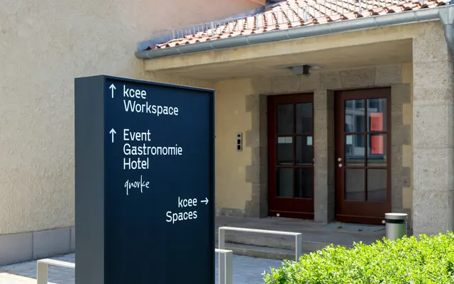
A condensed grotesque in four weights with a tall x-height, built for tight layouts and typographic hierarchies in editorial and brand work.
About
Narrow proportions and a raised x-height make this a practical choice where space is constrained, whether in mobile interfaces, packaging or dense editorial spreads. Four weights from Light to Bold allow basic hierarchy without the range needed for more complex typographic systems. The foundry cites a galactic-to-atomic design philosophy, which reads more as marketing flavour than a structurally distinctive feature of the letterforms.
Classification
Pangram categorises it as Brutalist and Grotesk; it is a condensed sans-serif with a tall x-height and narrow proportions, sitting within the grotesque tradition with a utilitarian, space-efficient character.