Phantom Sans
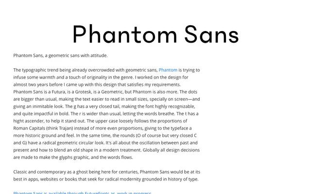
A geometric sans that blends circular construction with Roman Capital proportions, distinguished by oversized dots, a closed-tail g, and a wider r for improved screen legibility.
About
Phantom Sans sits at the intersection of Futura-style geometry and grotesque warmth, with specific details chosen to give it a recognisable texture: dots larger than convention for legibility at small sizes, a tightly closed single-storey g, and a tall t ascender. Uppercase proportions follow Roman Capitals loosely rather than the even spacing typical of geometric sans, lending a historical undercurrent to an otherwise contemporary construction. Available through Future Fonts as a work in progress.
Classification
Explicitly described as geometric sans with grotesque influences; design decisions follow geometric construction with circular rounds, though Roman Capital proportions in the uppercase add humanist warmth.