Grandmaster
Plain Form · Lucas Descroix · 2018
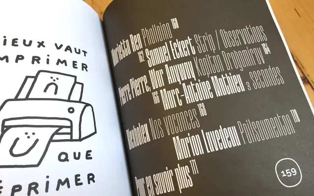
A very condensed titling typeface by Lucas Descroix, designed in 2018, with an extreme verticality that sits on the border between legibility and abstraction.
About
Designed by Lucas Descroix and released in 2018, it comes in 10 styles across five weights from Thin to Black, each with an italic. The extreme vertical compression and regularity of counter-shapes give it an almost kinetic quality suited to incisive editorial layouts and headline work. Its cultural references lean toward hip-hop and music publishing, with usage across Rolling Stone Italia, BET Awards and étapes: magazine confirming its range.
Classification
An extremely condensed titling typeface with highly vertical, rhythmic letterforms that push towards abstraction. Its narrow proportions and kinetic quality place it firmly in the display category, with no meaningful text use case.