Clear Pro
Positype · Neil Summerour · 2013
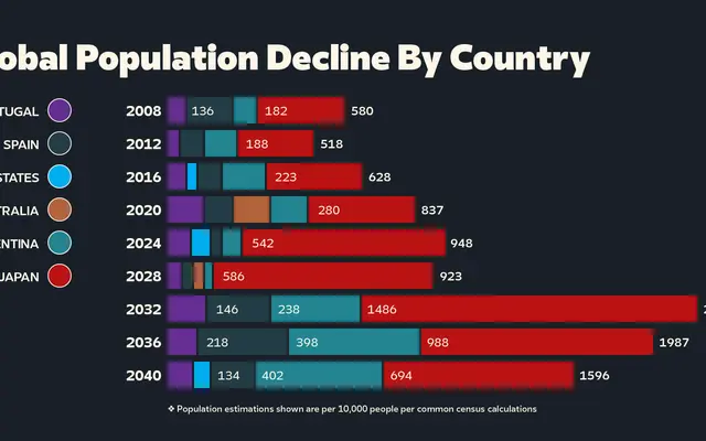
A geometric sans with origins in hand-painted lettering from 2008, expanded into 127 styles covering nine writing systems and 330 languages.
About
Originally hand-painted for a friend's identity project, Clear Pro has been developed over more than a decade into a large-scale geometric sans family spanning eleven weights with matching italics. Its reference point is the bold, direct lettering of early 20th-century signage, producing a voice that sits between assertive and approachable. Script support extends well beyond Latin to include Arabic, Cyrillic, Greek, Japanese, Khmer, Korean, Lao and Thai, making it a practical choice for genuinely multilingual work.
Classification
Described as a rational geometric sans serif inspired by early 20th-century signage lettering, combining precision with warmth; rooted in geometric construction with humanist influence.