Grava Display
Positype · Neil Summerour · 2019
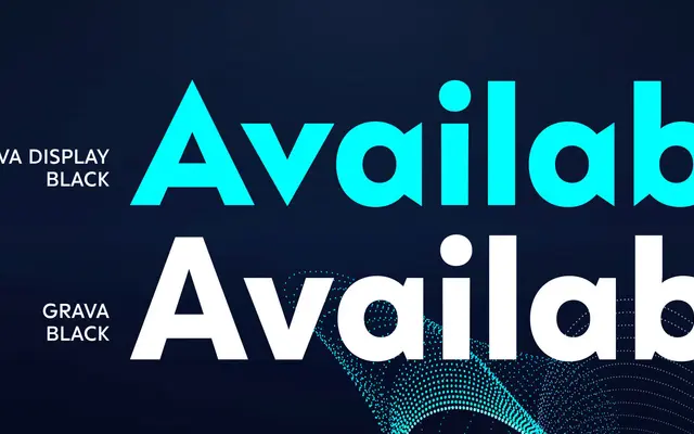
A display-weight geometric sans by Neil Summerour that replaces the category's typical coldness with sharp terminals and conspicuous angles suited to posters and covers.
About
Where most geometric sans families adhere strictly to circle, square and triangle and suffer for it, Grava Display deliberately introduces sharp points and flat-edge departures to give the geometry character. Ten weights from Thin to Ultra each come with obliques, and optional ligatures invoking midcentury modernism add further personality at large sizes. Latin, Cyrillic and Greek are included together as a single purchase, with every character individually spaced across all three scripts.
Classification
Grava Display is a geometric sans built on geometric principles but with deliberately sharp, pointed terminals and expressive detailing that push it toward display use. The foundry positions it within the geometric sans tradition while consciously departing from its typical coldness.