Kagawa
Positype · Neil Summerour · 2026
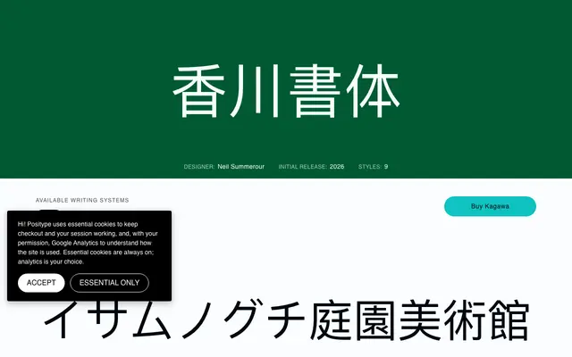
A nine-weight Latin and Japanese typeface by Neil Summerour, shaped by the landscape and culture of Kagawa Prefecture, with full JIS X 0208 kanji coverage and a variable font axis.
About
Drawn in tribute to Kagawa Prefecture in Japan, the design carries soft stroke terminations and gentle letterforms that reflect the region's character. The Japanese offering covers all 6,707 kanji at JIS X 0208 Level 1 and Level 2, with vertical typesetting features, halt and palt punctuation spacing, and proportional kana widths, meeting the standard expected by Japanese typographers. Nine static weights and a variable font spanning the full weight axis make it workable across editorial, body and display settings in both scripts.
Classification
The specimen text describes soft stroke terminations and gentle letterforms, suggesting a humanist rather than geometric or grotesque approach. The family covers both Latin and Japanese writing systems with variable weight support.